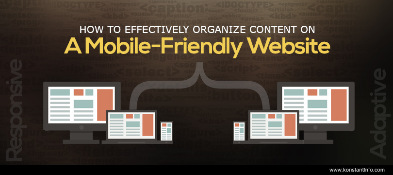
Today the average mobile user spends roughly 14% of their time surfing the web on their smartphone. This makes mobile website UX/UI a key centre of focus for any mobile aspiring business. The right kind of mobile website makes reading content, navigation and browsing on a website an easy task, irrespective of the device while the wrong kind of mobile website makes it harder for users to navigate and view the site. Before we get to the way content needs to be organized on a mobile website; let us take a look at the 2 kinds of mobile websites.
RWD was birthed due to the rising need for a mobile friendly user experience due to the high number of mobile devices and their users. The trend for RWD has gained massive momentum as businesses have come to recognize the potential offered by the everyday smartphone.
So, what is a Responsive Web Design? Websites that are RWD-centric are designed and created using CSS3, media queries and fluid grids that rely on percentages to effectively alter their composition and parameters to adapt to the resolution of the device they are being accessed on.
AWD was birthed a little while after RWD and delivers the same effect as RWD does but differs in the method that this effect is achieved with. Where RWD will alter its composition to fit the device resolution, AWD is carried out by creating several pre-defined layouts that are created for a wide range of resolutions. This method of going mobile friendly focus more on the server side of things, causing the web server to carry out all the work including detecting the browser resolution and rendering the correct layout .
This obviously means an increase in costs and time as compared to RWD since the developers have to create several different layouts to fit the various screen resolutions offered by smartphones.
Now that you are aware of the two possible ways a mobile website can be created, the question naturally comes to mind is; which one should you go with?
While both RWD and AWD fulfill the same basic goal of improving accessibility across a visitors’ mobile screen, they do differ in a few aspects. RWD is usually a safer option to bet on than AWD as it will alter the websites composition to fit ANY screen size. This means that your website will work well even with newer devices with different screen or browser resolutions. Moreover, adopting a RWD for your mobile website ensures that your developers have to deal with less hassle as it is easier to develop a single codebase for both mobile and desktop sites and simply add tweaks to the CSS code.
The downside to using the RWD method is that it tends to make the loading of websites a bloated and messy issue. Since RWD uses the same code for mobile and desktop sites, it means the smartphone is forced to download and sift through all the information irrespective of its relevancy to the mobile user.
AWD on the other hand holds a few advantages over RWD, primarily that AWD provides quicker performance and better user experience (UX). Apart from this, AWD websites also enjoy the ability to focus on user intent and organize the website content accordingly. Moreover, creating a website with AWD means that the layout can be updated continually to adjust for newer screen sizes and resolutions without the need to get back to the drawing board and re-create the entire code.
Konstant Infosolutions provides delightful Adaptive Web Design & Responsive Web Design services pertaining to both large and small enterprises. Our highly skilled and experienced developers have been immersed in the world of RWD and mobile friendly websites since the trend started and have delivered several highly successful projects to clients the world over.


Manish Jain is the co-founder and Managing Director at Konstant Infosolutions. He is responsible for the overall operations of the company and has played a major role in bringing Konstant up from its humble beginnings and, with his immense energy and drive, transforming it into a globally trusted name in IT solutions.

Or send us an email at: [email protected]


