To figure out the best that can be done to develop the operating system due to different screen dimension, the makers of the iPhone have definitely thrown a big challenge on the iOS developers. A pixel-perfect screen size of the iPhone has always been the trademark of Apple, but to unreservedly welcome the adaptive screen size across the mobile development platform, the tradition has been changed a bit. Prior to the iPhone 6, there have been very few differences in the screen size of the iPhone as compared to the smart phones running on Android.
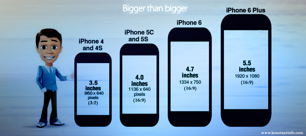
When one talks about the screen dimensions of different models of iPhone, which are supported by iOS 8, only iPhone 4s is the one that supports the aspect ratio of 3:2. A wide aspect ratio of 16:9 is supported by iPhone 5, iPhone 5C, iPhone 5S, and also the new iPhone 6 and 6 plus. Apple kept the pixel width of almost all the models constant at 640. It was the pixel height of all the iPhone models that changed from 960 to 1136. The change in the pixel height of iPhone transitioned the ratio of 3:2 to 16:9. However, with the prologue of iPhone 6 and 6 plus, both the height and the width of the models changed, keeping the fixed aspect ratio of 16:9. This change has been implemented in all the iPhone models supporting iOS 8. iPhone 4S is an exception in this assortment.
When it comes to screen design, it is difficult to support the iPhone 4 due to its shorter dimensions as compared to the other models of iPhone supported by iOS 8. Nevertheless, this is not some new challenge that the iOS app developers are facing, this was the same scenario throughout the development of iOS 7. Consequently, there are still some apps of iOS 6 that are not conventional of the 16:9 screen dimensions of the iPhone 5. This results in blank black bars on the upper and lower side of the screen by centering themselves on the screen.
Since the very beginning, Apple has made all the efforts to keep the apps in tune with iPhone 5, 5C and 5S that were specifically redesigned for iOS 7. Apple also tried to make these apps look as good as possible in iOS 8 for iPhone 6 and 6 plus. The auto-scaling properties that are inbuilt in iOS is considered to look better than the letter boxing effect that was earlier being dealt by the app owners. This was because of the fact that developers redesigned their screen size from the aspect ratio of 3:2 (iPhone 4 and 4S) to a more slender aspect ratio of 16:9 (iPhone 5).
The iOS developers will have to learn to make the best use of the new and fresh adaptive layout features present in the iOS. More particularly, the support of the @1x, @2x, and @3x pixel sizes are needed by the graphics, images, and icons to avoid the vague impression. Strategically, developers have kept the screen designing more supple and flexible than pixel perfect. Designing apps for the standard matching iPhone 5 and iPhone 6 is still well-likely to get adapted easily, but iPhone 6 plus is relatively bit more a challenge. The possible challenge that is prompting the developers to redesign the concept of some of the favorite iPhone apps is the increased support of landscape mode by the iPhone 6. Moreover, with the larger screen size of iPhone 6 plus, Apple has started to support the home screen in landscape mode as well as split view like that of the iPad for iPhone 6 plus.
Assisting and supporting the wide variety of screen size is relatively a new challenge for the iPhone developers, but this case is not new to the Android developers. As per the latest updates and information, Android, each year, has become more wide in the variants, and more fragmented when it comes to screen sizes, operating systems, and manufacturers. As per the recent statistics, this year there were more than 18000 different Android devices in the market as compared to last year. It is itself a vast occupation to keep track of all the Android-supported devices of different screen resolutions.
Apple has recently introduced its third category in screen density, i.e. @3x for the iPhone, but on the other hand, Android, since its years of introduction, has introduced and supported six screen densities, which are dpi, mdpi, hdpi, xhdpi, xxhdpi, and xxxhdpi. The objective that, as of now, is to be achieved by the Android developers is to avoid the over sizing of buttons, graphics, and icons on the screen, which is still a challenge for the iPhone developers that they will have to compete with.
The expert iPhone development team at Konstant Infosolutions has also fastened up itself to work efficiently towards the clientele needs to make sure that the apps does not lack in any way on any front.


Manish Jain is the co-founder and Managing Director at Konstant Infosolutions. He is responsible for the overall operations of the company and has played a major role in bringing Konstant up from its humble beginnings and, with his immense energy and drive, transforming it into a globally trusted name in IT solutions.

Or send us an email at: [email protected]


