5 App Icon Design Tips to Follow

Almost every app marketer is concerned about the app icon design, to stand out from competitors and develop something unique.
Honestly, an app icon design is not the first thing we see while reviewing a new app. It’s the popularity, functionality and User Interface that attract us more and yeah, our friend’s reviews about the app. But once we start using the app, we connect with it even more with each day passing and start exploring it in depth, and that’s the time that we relate with the app icon.
‘What a meaningful app icon; it defines everything about the app.’ You may have said it many times for your favorite apps because an app icon design makes an acute visual impression on you, especially when you find the app useful.
So, this is how it happens with your consumers as well. Like they say, for a business owner, it’s important to keep yourself in the shoes of the customer and then evaluate what’s missing and what’s likable about your app. The role of app icon design comes into effect when the marketing begins.
So, what exactly is an app icon design; it’s representing a visual definition of what your app does and the best features it provides. It’s the tiniest piece of branding, which can give your product an identity in the market such that the audience will recognize your app just from the icon.
Sometimes, people mix it up with the logo of a brand. Though the two share branding attributes, but an app icon has certain limitations in terms of design. It has to be created so small that it stays in the square canvas with restricted size and specific contexts while logos are scalable.
A good icon design is the one that users remember even after days and months. Here are a few tips to keep in mind while designing an app icon; they may sound cliché, but they are the groundbreaking commandments for impressing the audience:
Think of an icon, not an image: An icon may be a combination of image, logo, text symbol and all those elements used for representation. Highly visual and recognizable is the right definition of an icon, so more graphic representation leaves a lasting impression.
The best examples are Angry Birds Gaming app, where a colorful, animated bird is shown with a furious expression.
Another good example is WhatsApp, it represents exactly what the app offers, that is a message and a calling icon. The message icon has been taken from the Apple SMS app and is blended with the phone icon. So, this is how smartly WhatsApp team played with its icon design. Since Apple message icon was already palpable in user’s minds; WhatsApp team modified it and created their own, unique design.
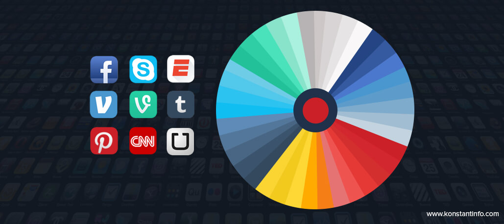
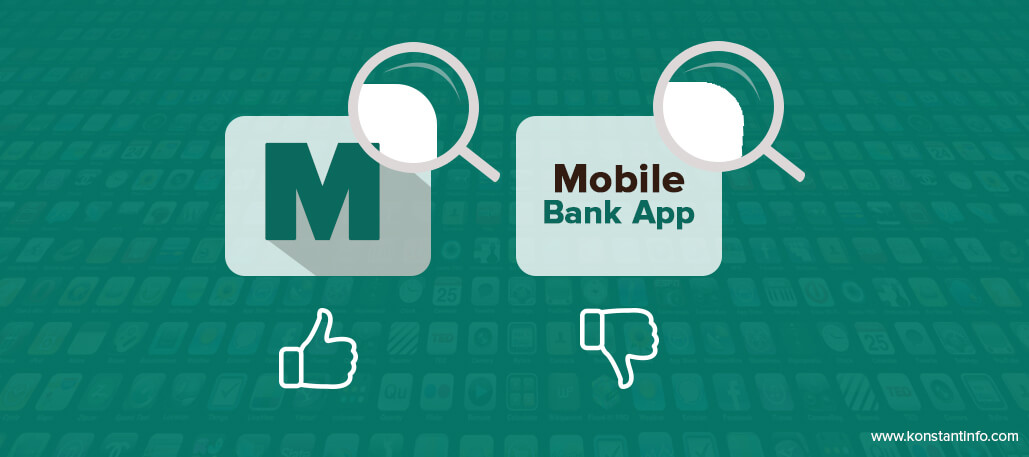
Don’t use long texts: Avoid writing a long word in your icon; words and texts are hard to read when inserted in such a small margin. Even if you want to symbolize with some text, use a letter icon as done by Pinterest, Uber (previous icon), Facebook, Vine, Venmo, Tumbler, CNN, ESPN.
Whatever it is, the icon must become so popular that a standalone image of it is also readily identified by the audience. For instance, think of the Skype’s S inside a white cloud, we are so familiar with the icon that even if it is placed on the billboard or is presented in some other color scheme, we can quickly tell ‘its Skype.’
Use Vivid Colors: Speaking of color combinations, the universal truth is that humans always fall for vibrant hues and vivid contrasts. The same applies to the app icon; gradient and dynamic hues always fetch attention, even though they are the basic blues, reds, yellows, orange, black, brown, combination of black and white, red and white and similar mixes.
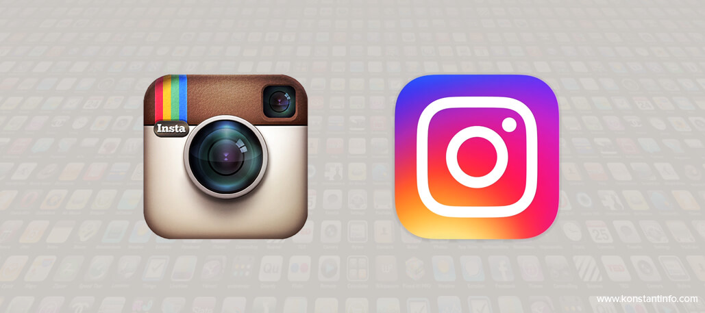
Conversely, sometimes warm colors too leave a soothing impression on users. As the response for Instagram’s new icon is not that good and people miss the old instant camera in shades of brown as it seemed subtle and more sophisticated. If not color, it may be the instant camera that held relevancy with what the app is all about; the skeuomorph that the users fell for.
But, Code Rise, the designer of the old Instagram icon recently said, “I’m super psyched on the new one.” He further mentioned, “I love the minimalism. Regardless of the colors behind it, the white shape — the actual bones of the new symbol itself — is beautiful, and I think that can persist over time.”
Nonetheless, people always take time to embrace a change. So, we hope it’s going to be true with the redesign of app icons for Instagram and Uber. We also feel that the new Instagram icon is more engaging and impactful.
All in all, make sure that the color contrasts and combinations are clear and alluring. Furthermore, do test the color scheme by placing it on different backgrounds; even if the background color is same, the icon must come out clear and distinct.
You have to touch the user’s emotions and sentiments through an icon design, so color selection is extremely important.
Emphasize on the Vector format: As mention above, the icon must be identified no matter where it is seen. So, it’s not only the App Stores that you are going to be visible.
To gain a business/product identity through your app icon, make sure you go for a vector image. It allows you to change the size of the icon for various views and devices. You will be requiring multiple versions of an app icon.
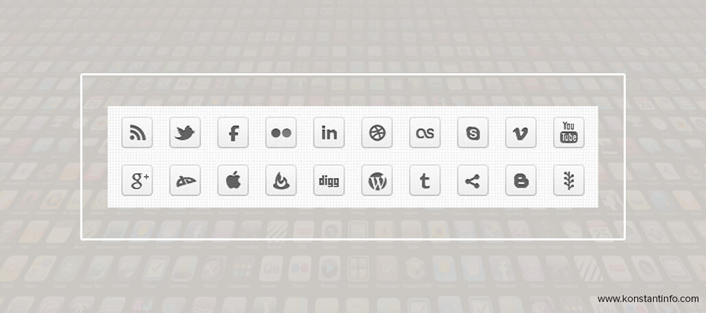
Think Monochrome: One way to ensure consistency of your app within varied audiences and on various platforms is to make it monochrome. Your app icon will be shown on boards where they use no colors and represent it in a black and white form.
For example, if your app is linked for social sharing on a blog site, your icon design must convey the same message as it does in its actual colorful format.
Technical Design Guidelines
There are few technical design guidelines that the designers must keep in mind for qualifying the criteria.
■ You now have to provide a 1024×1024px icon, so make sure it looks great full screen.
■ No copied designs will be permitted; it must be unique.
■ Don’t reuse app icons
They are different for Google Play and Apple Store. So read it thoroughly before your designer starts the work.
For best results, hire an expert app development company as it can provide you with skilled and experienced graphic designers.
But then, remember, only having a great app icon will not give you hundreds of downloads. It’s also the UI, UX and app functionality that matters to users. However, once the users start connecting with your app, the app icon will surely help them dig deep, read descriptions about the app and check out added features and then keep it on their smartphones forever.


